Rebranding Uprise Health
I worked with Uprise Health for about a year to develop their existing visual identity into an engaging, human-forward and easy to implement brand system.
Uprise Health provides companies with digital EAP services to support their employees’ mental health and wellbeing. Because they wanted to emphasize an empowering, tech-savvy take on mental health care, they were a great fit for my emotion-focused process.
Uprise Health was an extremely receptive client. The team members I got to spend time with were generous with their time and insight in our research calls and provided thoughtful feedback throughout the rest of the process.
Ready to start the process for yourself?
Fill out our inquiry formUpdates
Logo
Although they had recently rebranded, Uprise Health felt like their logo looked outdated. They noted that it was impossible to stack, which made it difficult to use. It was important to them to find a solution that felt modern and exciting to use without losing any brand recognition.
I uncaged the “Uprise Wing” (as we came to call it) from the circle and removed the gradient. I developed stacked, social, and b&w versions of the logo to make sure their design team had a robust and clear set of logo files to pull from.
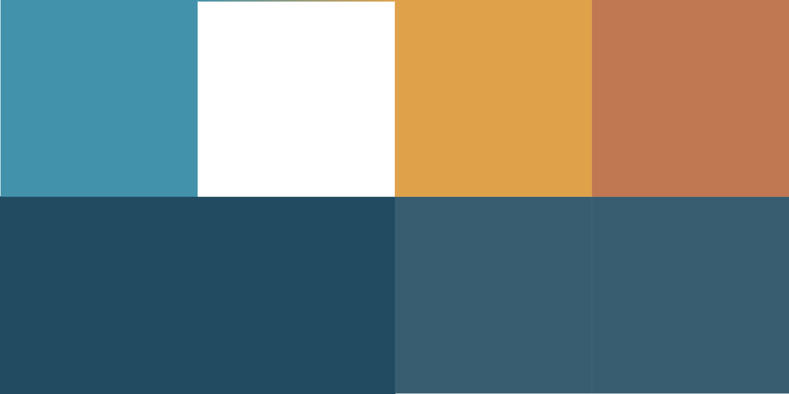
Color Palette
Uprise Health’s original color palette was causing causing cohesion issues. Pieces of collateral tended to split off into two different visual categories: salmon+green vs. shades of blue. This split wasn’t indicative of a split in content, it was just difficult to pair the salmon, green, and blues together in a way that felt pleasing to their design team.
Because we were sticking with blues for the logo, those shades were a must moving forward. I killed off the pink and the green and replaced them with an infinitely usable yellow.


Updates
Illustrative Identity
Uprise Health wanted to present the diversity of their users in a meaningful way. Because their product works across sectors, different jobs, lifestyles, ages, cultures, etc. needed to be represented. Before we started, they were using stock portraits as most of the visual illustration on the site, but the images felt impersonal.
Because we were essentially starting from scratch, I created a quiz featuring various illustration styles to see what the Uprise Health designers, executives and marketing team responded to. Data pulled directly from that poll guided some decision making and helped unify the team on how to move forward even with conflicting opinions.
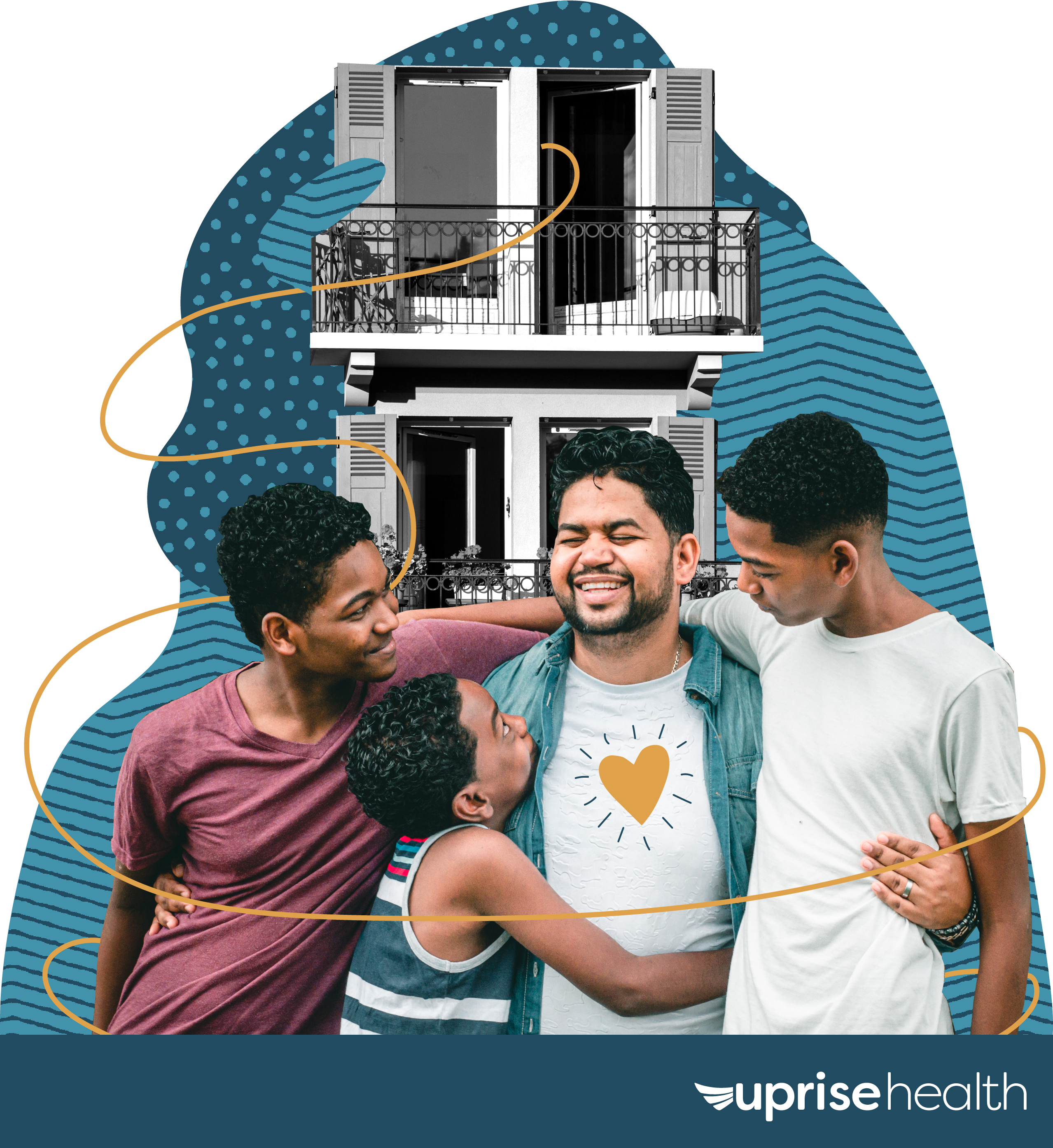
We ended up moving forward with a digital-collage style for the majority of the illustrations. By using the color palette I had already developed, adding textures, and including shapes that implied environment, motion & an element of surprise, each illustration “hero” got their own unique story.
The Final Illustration Formula
stock hero + desaturated environment + blue textured shapes + yellow pop = final illustration

Updates
Icons
As an extension of this style, I used the same color palette with the textures removed to create a set of custom icons and a few universal/abstract illustrations.


Stock Imagery
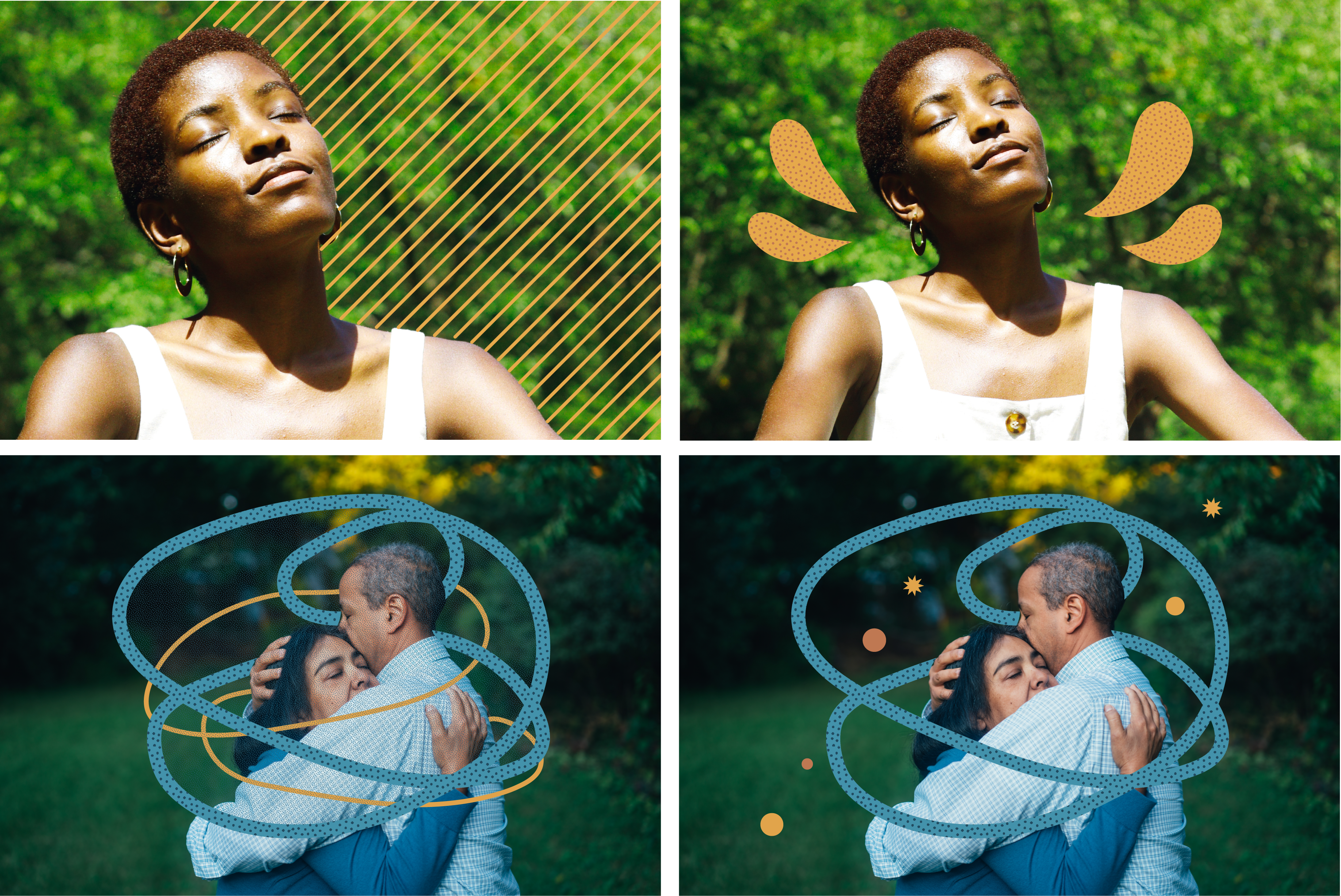
Uprise Health’s team was having trouble finding stock imagery that didn’t read as generic and impersonal. I created a checklist of characteristics that stock imagery needed to pass in order to be used, as well as quick ways to bring stock images into the world of Uprise Health. This included visually representing abstract and difficult topics. We discussed how to use simple shapes and textures to represent concepts like proactively taking care of your mental health, meditation, diagnoses of anxiety and depression, addiction in families and more.
(Stock Image Customization Examples. Clockwise from TL: Positivity, Meditation, Addiction, Covid Anxiety)
“…(the design leads) keep talking about how fun it is working with our new brand style. Thought you should know.”
While the main goal of a rebrand package is often improving the experience of customers or users, I think improving the experience of employees is just as important.

What about you tho
Ready to start on your own rebrand?
Better Visual Brand > Proud Employees > Motivated Designers > More Engaging Content > More Engaged Customers.
Fill out our inquiry form